

Essential Question(s):
1. What is the art movement, POP ART?
2. What artists were a part of the movement + WHY?
3. What is the style of the art movement, POP ART?
4. What is sgraffitto?
5. How has POP ART influenced our culture today?
6. How can the artists of today use the style of POP ART in their artwork without copying?
Mastery Objective(s): The student will…
1. create an original artwork in the style of Pop Art with sgraffito to demonstrate his/her understanding of both the art movement and techniques + processes.
sgraffito
-
a form of decoration made by scratching through a surface to reveal a lower layer of a contrasting color, typically done in plaster or stucco on walls, or in slip on ceramics before firing.The term comes from the Italian word sgraffire meaning (literally) “to scratch”.
Step No.1:
Create 4 thumbnails on 1 sketchbook page, brainstorming subject from today’s popular mass culture. These should be fast, 5 minute sketches in graphite.
Step No. 2:
Choose 1 of the thumbnails with the most original idea and best composition that shows an influence from the art movement, Pop Art. Use the small paper provided (it is the same proportionally to the final poster board size) to create a final sketch of the thumbnail you chose. This sketch should only take 15-30 minutes, but be more detailed than the thumbnail because it is your ‘blueprint’ for your final project. You can complete this in either color pencil or crayon. Crayon may be more difficult since the sketch is small. Use crayons to practice with the technique![]() and to verify the colors you are going to use in your studio project. You should be using some blending with the colors as well! (Yes, you can blend colors with crayons – who knew?)
and to verify the colors you are going to use in your studio project. You should be using some blending with the colors as well! (Yes, you can blend colors with crayons – who knew?)
This is a student sample of the final sketch in color. This student is will need to add patterns to the background colors, but she has a ‘plan’ for her final project now!


POP ART
Click here for more information on POP ART…
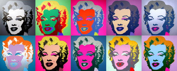
Andy Warhol. Marilyn Monroe Series (1962, 1967)

Andy Warhol Campbell’s Soup Cans 1962


Step No.3:
Get final sketch approved! Then using the dull side (not shiny) of your poster board sketch LIGHTLY with pencil a larger version of your final sketch.
Technique Hint #1: If there are lines that you want to make stand out, then I suggest using a Sharpie to outline some of these lines. (Do not outline everything and remember to use line quality to create interest and lead your viewer’s eye through the composition of the work!) You will not be able to use Sharpie on top of crayon later because of wax.
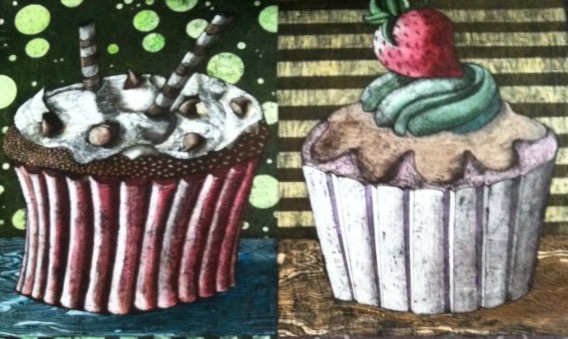
 Here is a detail of a segment in my Cupcake Sgraffito: If you look closely you can see the lines around the edges of the sprinkles and the whipped icing. In contrast, the background pattern does not have line around the edges of the circles; instead I chose to let those push back into the work by just scratching out the pattern.
Step No.4:
Get preliminary pencil layout approved! Then using crayons, follow your color design used in your final sketch to FILL in ALL of the surface of the poster board.

TECHNIQUE HINT #2: You MUST cover every single bit of the surface with crayon wax. It also MUST be built up; no thin, patchy layers of crayon wax. If you do not FOLLOW this hint, then your work will be ruined when you cover it with the india ink mixture!!! – you will get ugly, black transparent areas that you will NOT be able to scratch out to reveal color, instead you will scratch into your poster board!
Technique Hint #3: Do not bend your poster board at all. If it bends, the result will be an area that raises, separates the wax layer and soaks in the india ink mixture, rather than resists the ink with wax. Keep your poster board in excellent condition.
Technique Hint #4: If you want some thin, sharp, detailed lines then you may want to trace over some of your pencil layout with a Sharpie before you start coloring in with the crayons. After you lay down a layer of wax, the Sharpie will not go over the line as well or cleanly (the wax will get on the tip of the Sharpie and make the Sharpie unusable). However, rather than outlining every single line, focus on using those kinds of lines in areas that are supposed to appear closer to the viewer and remember to use varying degrees of line quality to create interest and lead your viewer’s eye around the work.
Step #5:
Watch INDIA INK DEMONSTRATION
Step #6:
Get color and wax layers approved! Follow the steps from the demonstration: Cover table with several layers of newspaper. Prepare paper towels into a hand-sized wads with the bottom smooth for spreading and wiping off excess ink; you will need approximately 3-5 for a full poster board or 2-4 for 1/2 of a poster board. Pour india ink mixture (about 3/4 parts india ink and 1/4 parts water) over artwork. Gently and quickly wipe off excess india ink mixture leaving a thin film of transparent black over the artwork. It should appear as though the artwork has ‘sunglasses’ covering the surface. Pick up and allow to dry on clean newspaper. Discard newspaper that is soaked with ink and used paper towel wads. Allow work to dry for about 5 minutes.
Step #7:
Using a variety of scratching tools and hatching techniques scratch very lightly into areas where you want color to come through or appear as lighter values and/or highlights in comparison to the areas where the crayon wax/color is covered by the dry india ink mixture. Do not just haphazardly scratch out everything! Be smart and intentional with this part of the process.
In this detail, you can see where I used a combination of hatching and placement to create value in the cupcake top with the chocolate chips and edible straws. I also did the same with the strawberry to create form.  I used Sharpie prior to coloring the strawberry to establish the strawberry seeds and texture, but on the other cupcake’s surface, I scratched out the lighter values to make the chocolate cake texture and as the cake’s surface moves around into the light the shapes creating the appearance of texture get smaller and closer together to give an illusion of lighter values.
Step #8:
DOUBLE-CHECK that your work has a STRONG COMPOSITION by following the steps below and verifying each with your work:
Hang up your piece and study it from a distance. You can take a picture of it as well and then go back to your seat to study the picture you took.
- Does the work have contrast?
- Check the balance of light versus dark values, the textures, the shapes and lines forming patterns.
To assist with this process, you can also hang the work upside down for analysis of the balance.
- Assure there is unity in the work by visually breaking down your work into 4 segments. Do all the parts of the piece work together to unify the work as a whole?
If you need help with this, imagine the work is divided into 4 rectangles or squares. Do the Elements of Art within each segment work together? Are all 4 segments different? All the parts of the art should work as one.
- Verify the piece has emphasis with a focal point and a working rhythm.
You are verifying all of the above by studying your work with fresh eyes or just ask 2-3 of your peers to look at your work hanging up at a distance and have her/him tell you what the first thing is that s/he sees. If 2 out of the 3 peers answer with the same area as the focal point, then you have a successful focal point in your artwork. Next, start at the focal point and make a mental note what direction your eyes are taking you through the artwork. Do you journey through the entire work or do you get stuck in one area and your eyes do not travel throughout the whole work? Your eyes should easily flow through the whole work.
Art with a strong, successful composition typically has all or the majority of the above Principles of Design present and functioning within. If you have accomplished this, met the requirements for the project and are pleased with the final product, then you can accept your sgraffito as ‘finished’.
STUDENT SAMPLES:


