
Drawing & 2D
INTERIOR SPACE with a VIEW
•In this breadth assignment you’ll use 1 or 2 point perspective to create a convincing interior space that includes a door or a window that lets in light. This piece should be more about how the light comes through the window or doorway and less about the view outside. You’ll work from a photo that you take. The room must be drawn in accurate 1 or 2 point perspective and rendered in Prismacolor pencil and/or if you have them Prismacolor or Copic markers. *NOTE: If there is another medium or format that you have an idea for other than what I have suggested, please come talk to me.
Process:
1. WHAT room will you draw? Choose a part of a room with a window or doorway that has light coming through it and is interesting to you. Choose carefully! I recommend that you draw a room in your own home, the interior of your car, etc. (Somewhere personal to you will be more meaningful.)
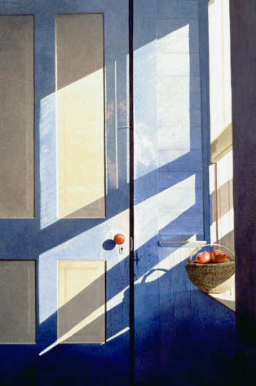
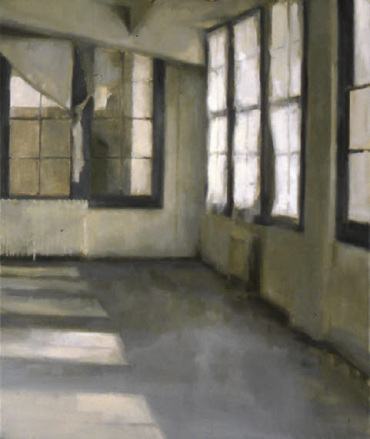
 2. WHERE will you stand in the room when you take your photo will determine weather it’s 1 or 2 point perspective. DO NOT take the photo of just the window with very little of the room showing, like this example on the right:
Also, avoid symmetrical compositions. They’re BORING! Use the rule of thirds grid on the camera to help you design a pleasing asymmetrical composition. What is the rule of thirds, you ask? Click HERE to visit Carrie King’s rule of thirds page!
Instead, stand to the side of the window, not right in front of it. And stand back far enough that you can see the wall meeting the ceiling or floor or both. You must show the light coming from the window or door as it falls on the wall or floor in the room.
*Remember, you CANNOT just print out a picture from the internet and copy it; this is visual plagiarism! YOU must take the photo yourself or your work will not be original. If you do not shoot your own photo you can’t use the work in your AP portfolio and I will not grade it!
3. WHEN you take the photo is very important! Remember, the light is the star of the show in this piece so the time of day that you take the photo will determine how the light enters the room. The light will be very different at different times of the day. The best time for direct light is early on a sunny morning or late afternoon but the direction that your room faces will also affect the light.
4. After you take a photo of the space you’ve chosen, print it out in black and white, no color prints! You may use a cell phone camera to take your photos but you MUST print it out; you cannot work from your phone!
5. HOW can you figure out the type of perspective? I can help you with this, but the easiest way is to line up several rulers along the horizontal receding lines in the photo, like the edge of the wall & ceiling. If they all line up with one point (which may be waaaaay off the edge of the paper), then it’s 1 point perspective. Or if they seem to be going in different directions, then it’s probably 2 point. BE SURE YOU KNOW WHICH YOU’RE DEALING WITH before you start your drawing!

Here you can see how the vanishing points were found on a photo by lining up two or three lines going the same direction. I often do this using two rulers.

If you’re doing 2-point it’s often best if your vanishing points are FAR away from each other, even beyond the edge of the paper. Feel free to put them on the drawing board. Just be sure they’re level by using a yardstick to make a horizon line.
You need to know where your vanishing points are in order to draw your room accurately. *Open doors and objects in the room may have their own vanishing points!
(You can crop in on a smaller area that you want to draw AFTER you’ve done this step!)
6. WHAT media should you use? You should use 9″ x 12″ Bristol Board for your final draft. I recommend you tape off a border and attach it to a large sheet of newsprint so that you have room to draw any vanishing points that will be off the edge of your bristol. Sketch lightly in pencil first, starting with the vanishing points and major parts of the room.
*You may include as many or as few details and objects in the room as you wish. I’d recommend that you include enough so that it’s interesting but not so many that it’s distracting from the light.
7. Once you’re certain that the room has been accurately sketched you will add color using a monochromatic color scheme (OR if you have the option of a limited palette of no more than 3 colors). Limiting your color scheme will give your piece more unity (too many colors can look disjointed and crazy). Obviously, you’ll need a wide variety of values of your color for the monochromatic option. If you’re using a limited palette you’re not limited to just 3 pencils. You’ll need light, medium and dark versions each of your colors, so you’ll need at least 10-15 pencils. You may use any color media that you already are familiar with but I’d recommend that you use one that lends itself to precise work using a ruler. For that reason, pastel may not be a good choice.
Here are some of my AP Studio Art student’s examples:
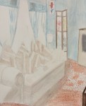
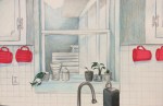
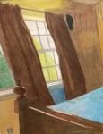


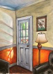


Below are some examples from Carrie King’s AP Studio Art students:
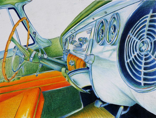

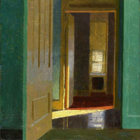
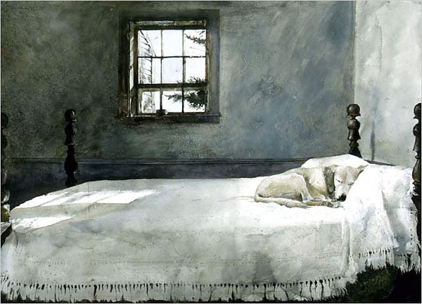
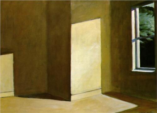
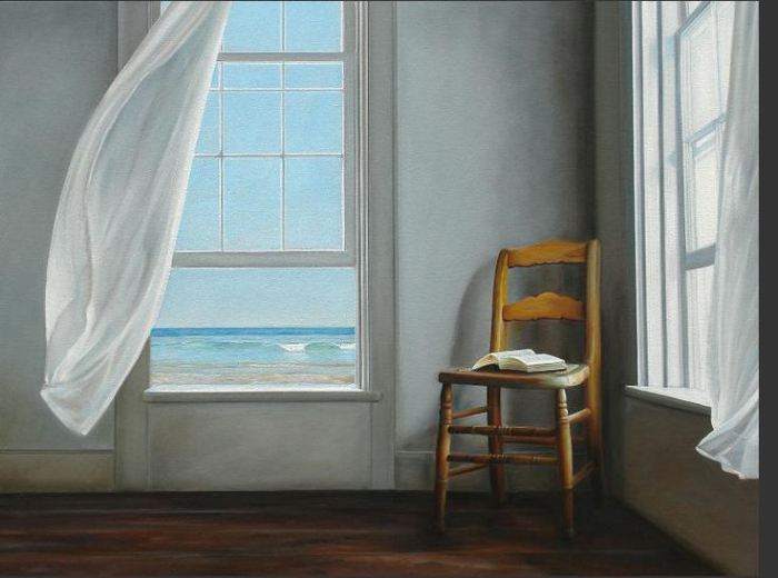
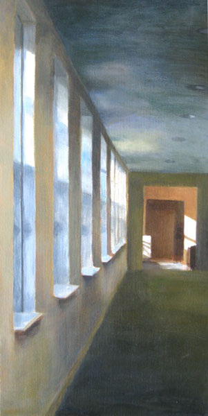
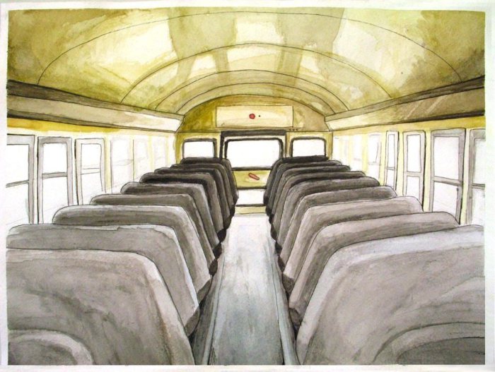
Below are some examples from various artists:


Varsity Option:
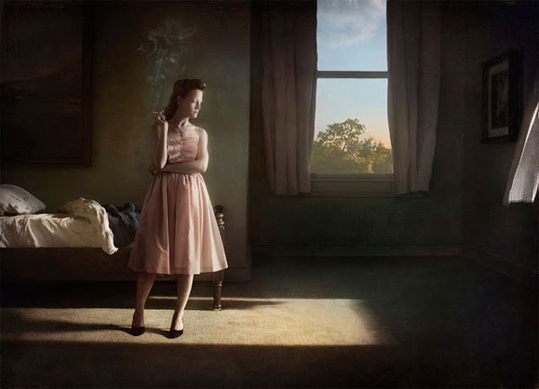
Varsity AP students may choose to include people in the room. However, be sure that the focus of the piece remains on the LIGHT. Here are some examples by various artists:
Need MORE HELP?
Here’s a powerpoint on perspective & creating depth: PERSPECTIVE Powerpoint
And here’s an excellent time-lapse video of drawing a room in 2 point perspective:
2D (PHOTOGRAPHY)
The theme of the breadth assignment is as it is above, only with a camera and film. Your film type & technique is open choice.
- Play with light. See how it works – reflects & refracts.
- Color is an option, so that if you choose to play with different colors of light, you can.
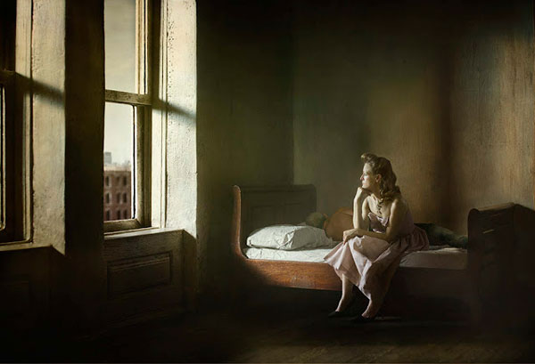
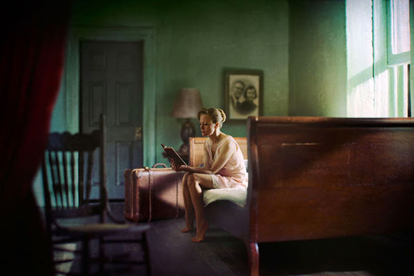
Below are examples from the photographer, Richard Tuschman (inspired by Edward Hopper): 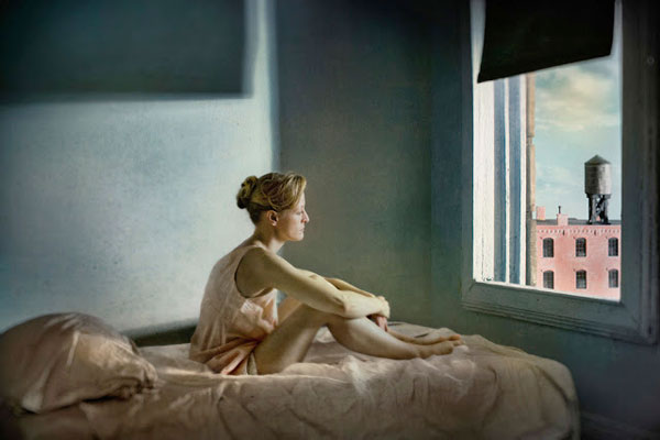
Below are examples from various photographers:
Some OTHER GREAT BREADTH ASSIGNMENTS using PERSPECTIVE and SURREALISM:
